


Unveiling the Disguised Meaning Of Colors in Art 📰

The colors we surround ourselves with unknowingly influence the way we feel emotions. While some shades take us one step closer to serenity, others exude sorrow, wonder, excitement, anger, and every possible feeling we can experience in life. For years, interior designers, advertisers, graphic designers, and artists have been using this concept to their advantage, introducing numerous colors in their work to enhance our surroundings.
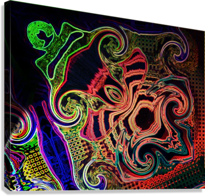
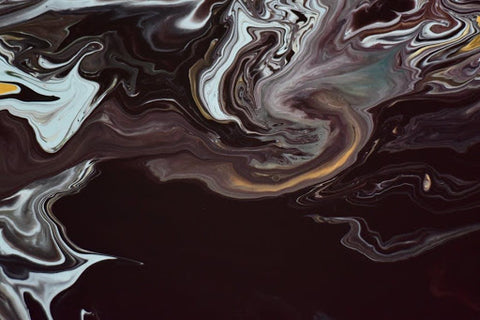
The disguised meaning of colors is widely used as a powerful weapon in all kinds of arts. Abstract art is one of the most influential modes of creativity that reflects colors in a majestic yet astounding way. However, once we understand the basic principles that hide behind the several shades of life, we can experience the enchanting imagination brought out by each artist’s work.
Before we get into detail about each color in the spectrum, let’s do a quick review of the color theory history:
-
Leonardo da Vinci, a renowned artist and inventor, was the first to talk about the various color principles.
-
Isaac Newton, the English mathematician, introduced the Theory of Color in 1666. His experiments revealed the concept of primary colors.
-
Moses Harris, an entomologist, was severely influenced by Newton’s theory. He created the first color wheel in 1766, which consisted of the primary colors.
- In the early twentieth century, German painter Johannes Itten extended the previous version of the color wheel by adding secondary and tertiary colors. He also came up with the idea of warm and cool colors.
Primary Colors
Primary colors are those that can’t be created by mixing any other shades. There are three of them:
- Red
- Blue
- Yellow
Secondary Colors
These colors are a combination of primary colors. For example:
- Red + Yellow = Orange
- Red + Blue = Purple
- Yellow + Blue = Green
Tertiary Colors
The tertiary colors are a blend of primary and secondary shades. Such as:
- Blue + Green = Blue-Green
- Yellow + Orange = Yellow-Orange
The Disguised Meaning of Colors in Art
Now that we know the basics about each color and where they originated from, let’s move on to the intriguing part where we unveil the hidden meaning of all majorly used art shades, starting from primary colors:
1- Red

Red is a color of several meanings, signifying a pioneering spirit, action, determination, passion, adventure, and danger. The ancestors considered this color as the shade of fire and blood. The history of colors also reveals that red was the first color to be introduced after black and white.
In paintings, red is usually the first color that grabs a viewer’s attention because of its radiance that stimulates deeper than any other shade. It excites the emotions while motivating us to take action. That is why red is also used for the ‘stop’ and ‘alert’ signs worldwide.
Artists typically use red color in paintings to bring out their strong-willed or aggressive emotions that awaken a physical life-like force in the beholder’s eyes. We can distinguish between these distinct emotions by observing the art movement and patterns. If the mentioned color is used in harmonic balance, it is usually the indication of a positive outlet and retrained opulence, like love, desire, and confidence. However, red color can connote negative notions, such as anger, manipulation, fear, and caution when used too much.
We come across several shades of red while exploring abstract arts. The ones that are used the most are burgundy, maroon, crimson, and scarlet:
Burgundy -This is a dark purplish-red shade that exudes sophistication and lightly toned energy. It represents power, ambition, and courtly action.
Maroon - It is a dark red color that is not as dramatic as pure red. However, it expresses thoughtful action and profound control.
Crimson - If you are looking at art with crimson shade, don’t take it as a bad sign. Crimson is a shade that is inclined towards purple, emitting sensuality, and determination to succeed.
Scarlet - Scarlet portrays enthusiasm and zest as long as it is used with modesty. The second it crosses that limit, the art begins to emit an aggressively domineering aura.
2- Blue

Blue is the color of serenity and expansiveness. From cool turquoise to warm night sky, this color exhibits a sense of calm on all occasions. Blue is sharply refracted by our eyes, causing the retina to flatten while making it look receding.
Artists extensively use this color to communicate their emotions with the world. It is an ideal medium for them to splendidly express their innermost strengths and spirituality without threatening the viewers with conservative assertions.
In abstract art, blue should never convey impulsiveness or spontaneity. As long as the expressionists use this color with rhythmic movement, it refrains from overwhelming the audience with unpredictability. You may see numerous shades of cool and warm blues when it comes to artwork. However, some are usually the artist’s first and favorite picks due to their varying disguised meanings in art:
Sky Blue - The color of the cloudless sky is the calmest of all blues. It inspires selfless love and loyalty while promoting the feeling of overcoming all obstacles. Sky blue is considered a natural healer.
Dark Blue - This is the color that represents knowledge, integrity, and power. It is a composed color that is closely associated with responsibility and deep emotions. While dark blue is a color that represents compassionate and collected thoughts, it can also portray a pessimist’s feelings and worries when used sublimely.
Pale Blue - Pale blue emits imaginative thoughts and the will to break free of your self-installed chains.
Azure Blue - It is the color of contentment and determination. Artists use azure blue to announce their sense of purpose and desire to accomplish their goals.
3- Yellow

The yellow color resonates with our brain’s logical side, stimulating it with illuminating thoughts and happiness. This color is usually inspired by practical thinking, optimistic ideas, and confidence. However, contrary to what many people think, yellow is not explicitly used to express only cheerful aspects of life when it comes to art. This color is also streaked with the essence of egoism, betrayal, and madness, primarily when used as an undertone. For instance, while marigolds are considered bright flowers worldwide, these are associated with death in some regions.
Yellow is one of the most prominent shades in the color wheel because of its sharp intensity that hits our retina differently than other colors. While many artists use this color to add a secondary light source to brighten their canvas, it can cause irritation and anxiety when used excessively. To sum it up, yellow color exhibits a painter’s emotions that can be severely distinct from each other. Mainly, this color represents logical creativeness, decision-making ability, self-criticism, and emotional instability.
Artists typically use numerous shades of yellow to represent each emotion independently. Here are a few of them:
Lemon Yellow - This color promotes self-reliance and elevates an artist’s sensitivity to criticism.
Golden Yellow - This shade of yellow depicts deep curiosity and wonder.
Citrine Yellow - The greenish-yellow color exhibits unstable emotions, and it can be used for portraying deceit and vengeance.
Dark Yellow - The darker tones of yellow are usually an indication of depressive thoughts and low self-worth. Artists use this color when they want to share their worries with the audience.
Pale Yellow - The paler shades of yellow are a symbol of a clear mind and alertness.
Cream-Yellow - The cream-yellow shade conveys a lack of confidence while revealing the need for constant assurance.
Now that we have uncovered the disguised meaning of primary colors in detail, let’s move on to the basic secondary and tertiary colors that are most often used in art.
4- Green
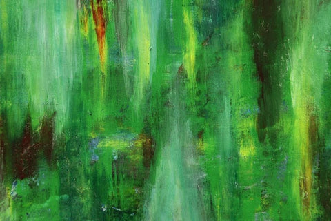
Green is the color of harmony, nature, balance, and peace. It is a shade that rejuvenates our souls when we are physically, mentally, or emotionally exhausted. Green is also a representative of healthy possessiveness and nurturing. However, while it is a remarkably calming shade, there are times when green color also portrays jealousy, sickness, and conflict.
Here are a few shades of green that artists use in their work for conveying their emotions:
Aqua Green - Aqua green is the color of calmness and spirited soul.
Pale Green - Lighter shades of green pronounce immaturity, inexperience, or a fresh perspective.
Olive Green - Many people depict this color positively because of the expression, ‘offering an olive branch.’ In reality, it suggests deceit and treachery in art.
Emerald Green - This tone of green is usually associated with wealth and materialistic well-being.
Yellowish Green - Yellow-green color represents cowardice, fear, and conflict.
5- Purple

Purple color is associated with creativeness, imagination, and spirituality. It is also deeply connected with the transformation of an artist’s soul from a psychological perspective. Along with the emotions of unconditional and selfless love, this color is also encouraged in art pieces for exhibiting sad and gloomy feelings.
Painters use several shades of purple to describe their innermost inspirations:
Lavender - This shade of purple defines vulnerability, sensitivity, and fragility.
Amethyst - Amethyst is a color that opens the artist’s intuitive channels. In other words, it is the color of an evolved soul.
Plum - This shade of purple is typically linked to narrow-mindedness and prudish behaviors.
Mauve - Mauve is used by artists to describe justice, concern, and mental well-being.
Deep Purple - This is the color of the highest level of spirituality and liveliness.
6- Orange

Orange is a striking color that can be assertive yet spontaneous at the same time. It signifies fearlessness, confidence, and youth in an artist’s work. Furthermore, orange is the color of rejuvenation, vitality, and deep enthusiasm. However, the deeper shades of orange usually portray distrust, aggression, or a thirst for action.
Artists use the orange shade in many different ways to portray their emotions to the world. Here are a few that are majorly integrated into all artworks:
Golden Orange - This tone of orange is usually used for signaling self-control and confidence.
Dark Orange - Dark orange is the sign of over-confidence and over-ambition. It expresses the self-esteem of an opportunist who will take selfish steps to accomplish his goals if necessary.
Peach - This color promotes worldly confidence to communicate and socialize in an inspirational manner. The influenced attributes associated with the peach color include softness, gentleness, and cautiousness.
Burnt Orange - Burnt orange or flame orange is the color of pride, aggression, and tense behavior.
By far, we have discussed the essential primary, secondary, and tertiary colors that help artists bring a magnificent masterpiece come to life. However, there are two neutral colors without which art remains incomplete - black and white. Let’s go over them for deciphering the vital role they play in art.
7- Black
Many artists include black color in their work for integrating the element of mystery. While it is a neutral color, it is made by combining all the various shades in the world. Therefore, the meaning behind this color also varies differently for each artist.
Mainly, black color represents dignity and sophistication. However, other times, it can exude depressing vibes, pessimism, and aloofness. It also depicts the feeling of the unknown on many occasions.
8- White

The color white is one of the purest shades that exhibit innocence and perfection. It can feature several meanings in an art piece, including balance, equality, fairness, justice, peace, and independence.
White color is vastly reflective, as it awakens openness, creativity, and growth. Artists significantly use this shade in their paintings to create harmony, balancing other radiant colors with a splash of white. However, sometimes it is also used in artworks for expressing the rawest and genuine emotions like deep sorrow or lost love.
By remembering the meaning of all these significant colors, we can comprehend and appreciate the hidden implications and inspirations of any artist’s work without a problem!